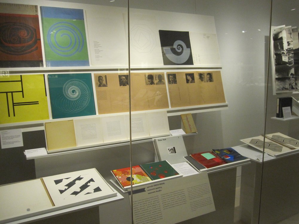
Spirale (1953-1964): Concrete Poetry, Concrete Books
Concrete poetry is a typographical art. In the form of carefully arranged yet non-grammatical sequences of words, or in meticulous patterns of isolated letters, numerals, and punctuation marks, typography provides its raw material. A common concern of concrete poetry was how simple, beautiful, graphic arrangements of linguistic elements can nevertheless give rise to disorientation—in space and in reading.
Linking the graphic potential of punctuation to the production of space on a map, Helmut Heißenbüttel referred to his poems as “topographies.” Gomringer’s poem beginning “cars and cars,” an example of what he called a “constellation,” shows the repetitious and playful exploration of symmetry and exchangeability typical of his poems. Ludwig Gosewitz’s “typograms” further reduce typography to its most basic graphic marks, eliminating words and letters in order to initiate a rhythmic visual reading process.
Many of Dieter Roth’s early “concrete” books were first made in the years when he was an editor for Spirale. They contrast with his later work (seen elsewhere in the exhibition) in the precision of their geometrical design and the tactile engagement they solicit. All of his books, however, share a persisting preoccupation with embodiment and perception.
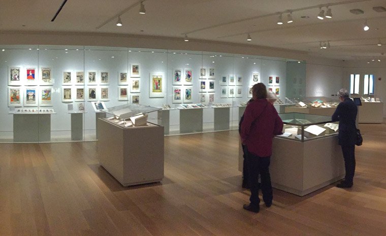
Staff photograph
Installation view of items selected for the section Spirale (1953-1964): Concrete Poetry, Concrete Books.
Bern: Spiral Press, 1953-1964
Rare Book Collection
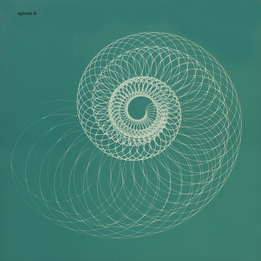
Bern: Spiral Press, 1953-1964
Rare Book Collection
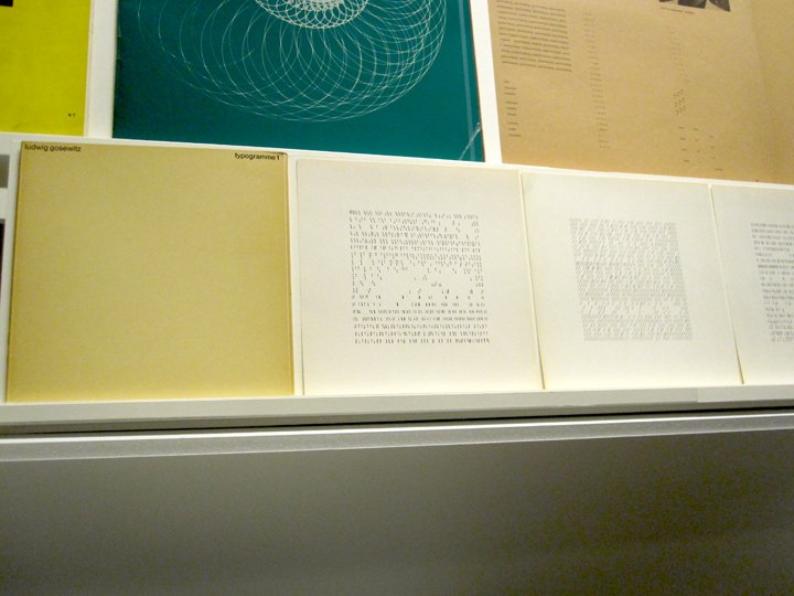
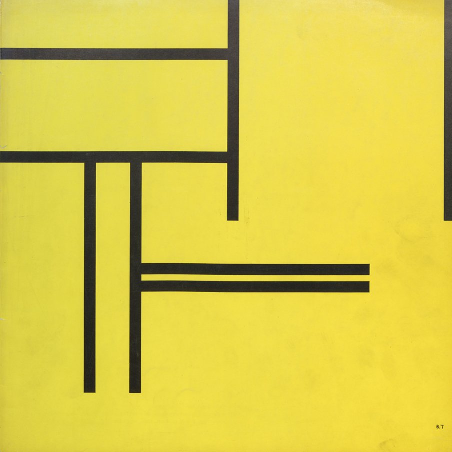
Ludwig Gosewitz (1936-2007), German
Frauenfeld: Eugen Gomringer Press, 1962
Rare Book Collection
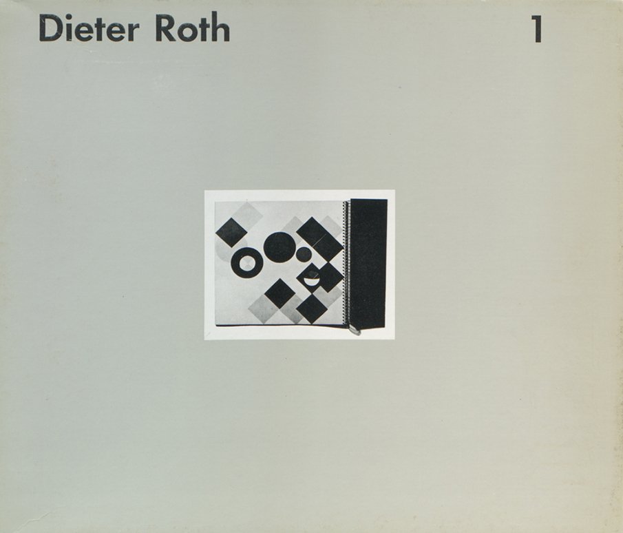
Dieter Roth (1930-1998), Swiss-German
Stuttgart: Edition Hansjörg Mayer, 1976
Gesammelte Werke, Band 1
Rare Book Collection
In 1957, Roth made unique examples of these books, giving the Kinderbuch to his friend Claus Bremer’s son. Only after beginning a long-term collaboration with the printer and poet Hansjörg Mayer did Roth recreate many of his early books in larger, salable editions that he would call his “Collected Works” (Gesammelte Werke). Issued together as Gesammelte Werke 1, these two books were printed in an edition of only 1000.