© The University of Chicago Library
1100 East 57th Street Chicago Illinois 60637
Phone Numbers

Click on the hypertext links below to see a group of maps that make up a portrait of the urban geography of Chicago and some of its suburbs in 1990. (For maps based on data from Census 2000, click here.)
The maps are divided into four categories:
[1] Tract-Level Maps of Chicago and Close-In Suburbs
[2] Sample Maps at Other Levels of Analysis
[4] Maps Showing Changes between 1980 and 1990
These maps constitute a small subset of the essentially infinite number of maps that can be produced from 1990 census data at the University of Chicago Map Collection. Any phenomenon enumerated by the U.S. Census can be mapped at any scale for any part of the United States.
The maps were produced from the U.S. Census Bureau's Tiger/Line Files and Summary Tape Files with Sammamish DataSystems' GeoSight FactFinder Professional software (version 4.3B).
Most of the maps are choropleth maps: maps in which polygons (e.g., tracts) are divided into distinctly colored or shaded classes. In any choropleth map, the selection of class intervals, colors, and patterns can affect the map's message.
Note that these maps will only display properly on terminals that can distinguish 256 colors (that is, those that can handle 8-bit color).
Robert Knippen handled most of the technical aspects of this project. David Farley provided a considerable amount of useful advice. Ari Zentner and colleagues at the Social Science and Public Policy Computing Center provided the 1980 data. And Sunia Abdula did the inputting necessary to consolidate 1990 data to 1980 boundaries.
The heavy dark line on all of the following maps indicates the city limits of Chicago. The heavy blue lines indicate freeways.
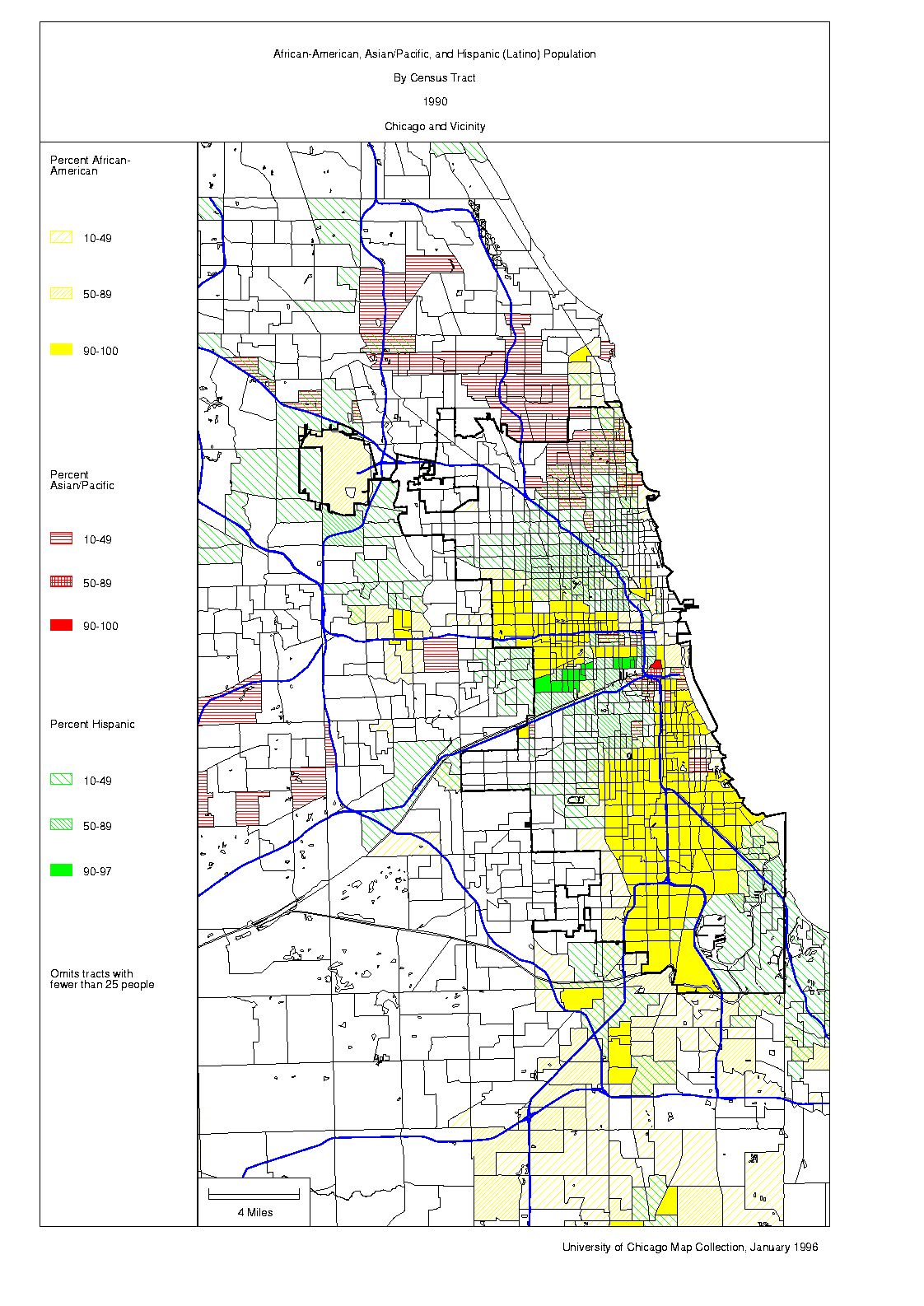
African-Americans, Asians and Pacific Islanders, and Hispanics (Latinos). Large parts of the South and West Sides of Chicago are essentially all African-American. Except for Chinatown and Little Village, most neighborhoods with large numbers of Asians and Hispanics are more heterogeneous.
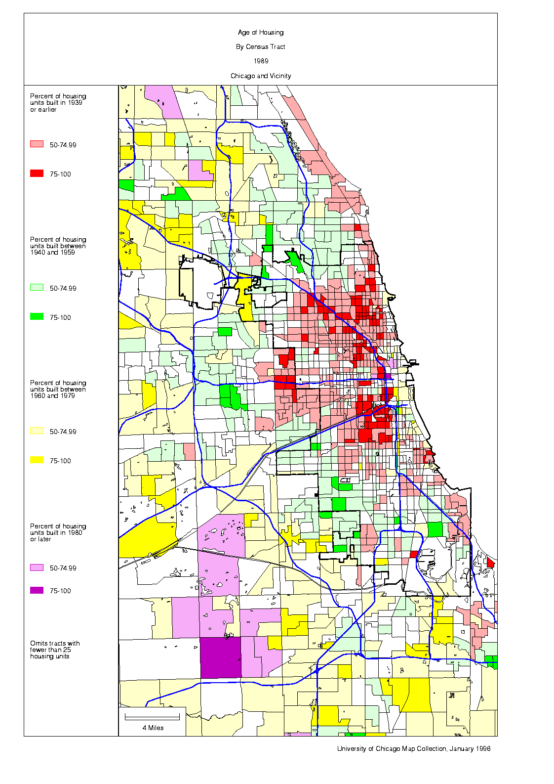
Age of housing. The redevelopment of large parts of the central city is the major factor breaking up generally circular "age rings" around the Loop.
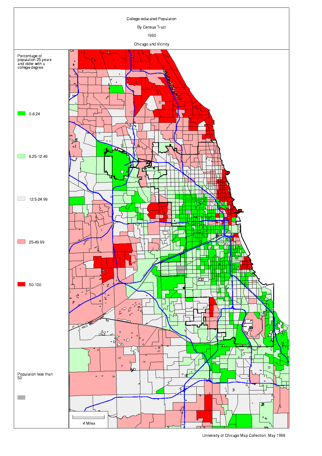
College-educated population. The areas where college-educated people make up the largest parts of the population are the North Side Lakefront, certain well-off suburbs, and Hyde Park.
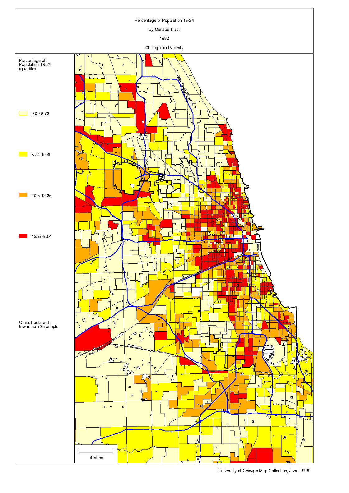
18 to 24 year olds. Areas with the largest proportion of 18-to-24 year olds include several neighborhoods with universities--and Little Village and Pilsen, many of whose residents are recent immigrants from Mexico.
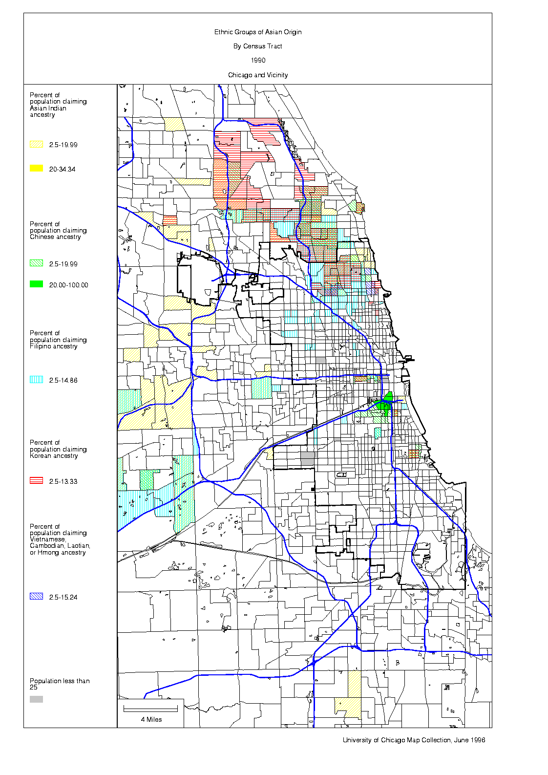
Ethnic groups of Asian origin. Persons of Asian ancestry are widely scattered over the middle- and working-class neighborhoods of Chicago and its suburbs, especially on the Northwest Side. Except in Chinatown, however, they invariably constitute only a small minority of residents, even near the Indian, Korean, and Vietnamese commercial strips along Devon and Lawrence Avenues and Argyle Street respectively. The distribution of persons of Asian ancestry is really too complicated to be shown clearly on a map of this size!
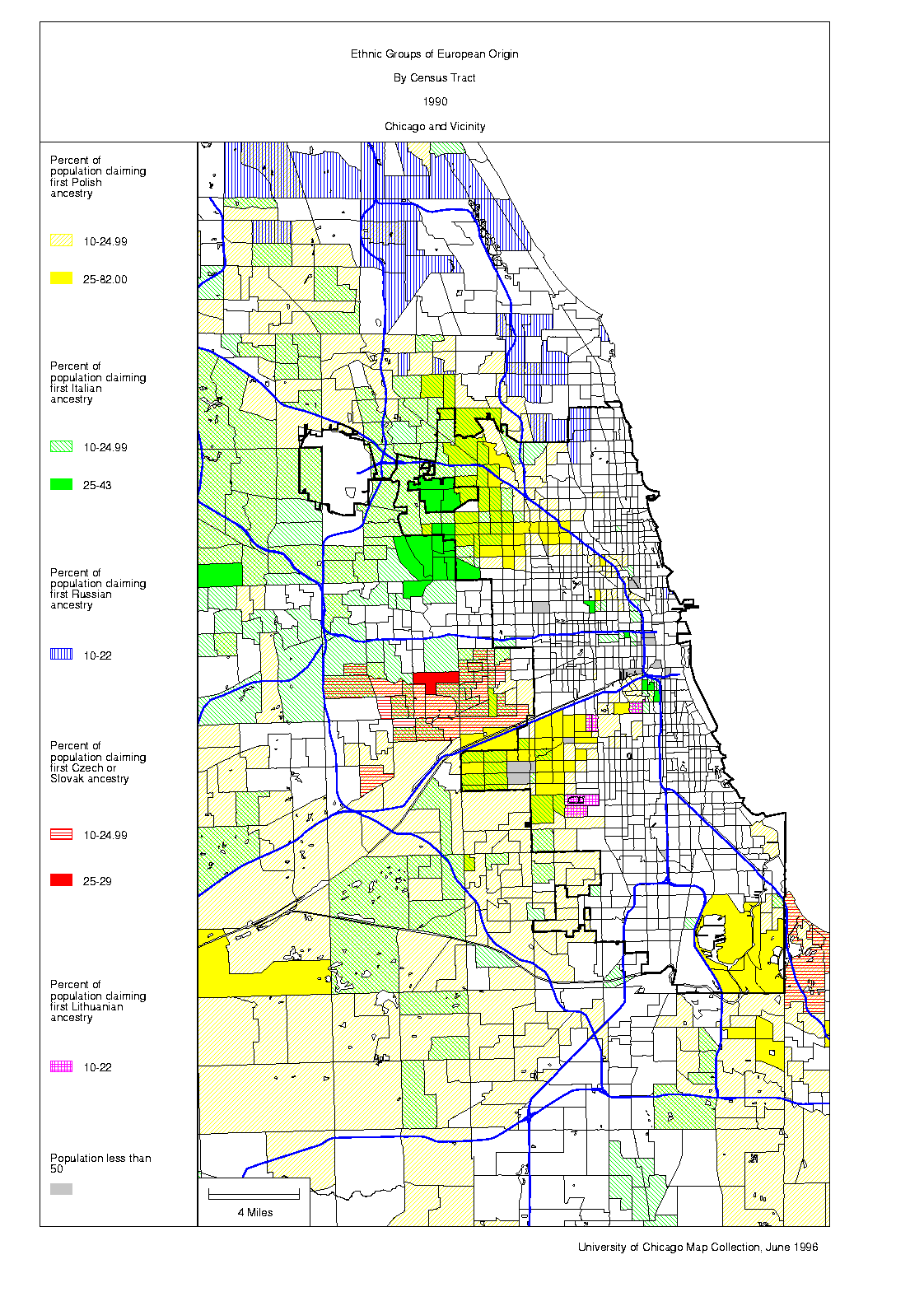
Ethnic groups of European origin. Chicago is known for its ethnic neighborhoods, but, in fact, there are hardly any tracts in Chicago or its inner suburbs where a majority of residents report the same European ancestry. There are, however, certain parts of the city and (especially) its inner suburbs where one group or another predominates.
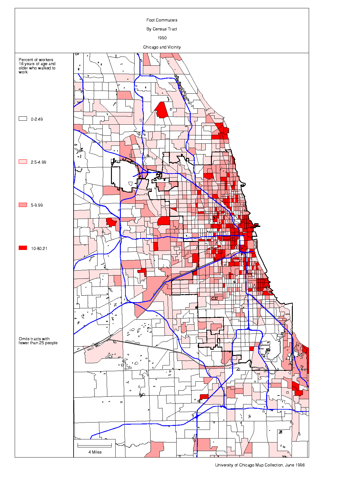
Foot commuters. Relatively few people walk to work in Chicago. The chief exceptions are in the newly residential neighborhoods around the Loop and in the areas close to major universities.
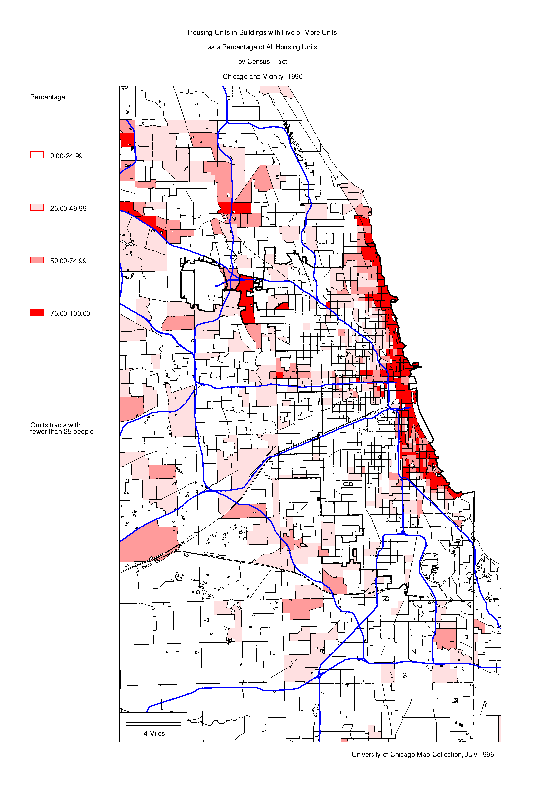
Multi-unit dwellings. Chicago's stock of high-rise apartment buildings includes both some of the most expensive housing in the city and some of the most wretched public housing projects. Whatever its economic status, high-rise housing is mostly found close to the Lake.
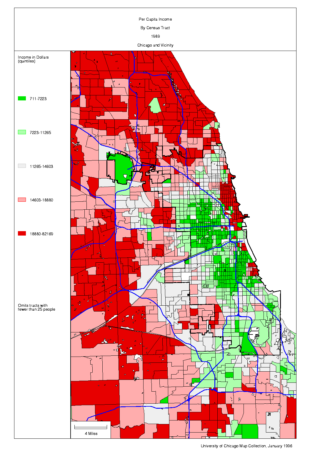
Per capita income. The Near North Side and certain suburban areas have the highest level of per capita income in the Chicago area. Parts of the South Side have a per capita income only 2% as high.
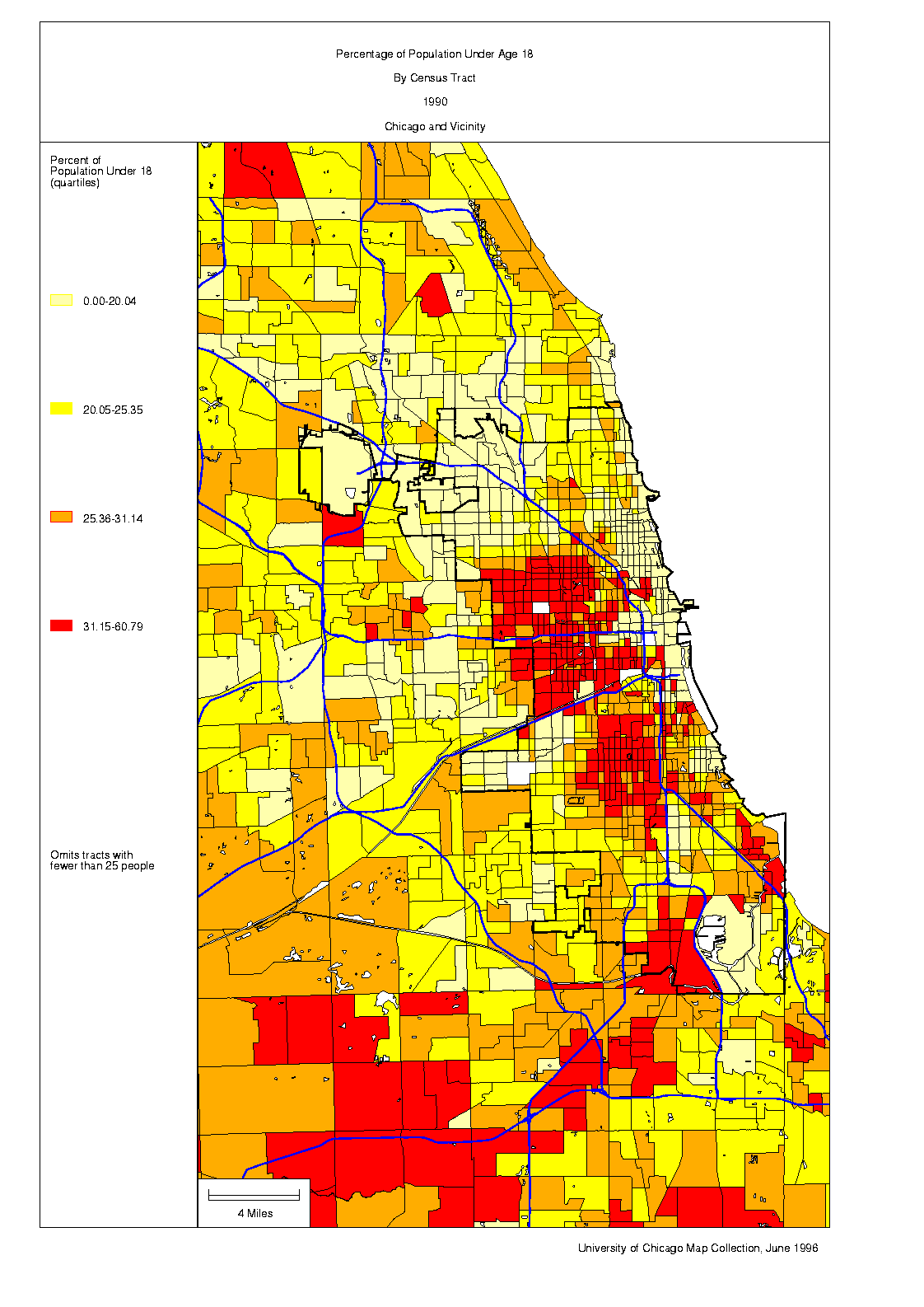
Persons under 18. Children and teenagers generally make up the largest proportion of the population in the lower-income neighborhoods. There are relatively few persons under 18 in the well-off neighborhoods on the North Side or in most inner suburbs.
Population density. Population density is, as in most cities, inversely correlated with distance from the center. But the largely industrial corridors along the two branches of the Chicago River have few residents, while the generally prosperous neighborhoods on the North Side Lakefront tend to have more persons per square kilometer than one might expect on the basis of their distance from the Loop, while some of the problem-ridden neighborhoods of the South and West Sides have fewer.
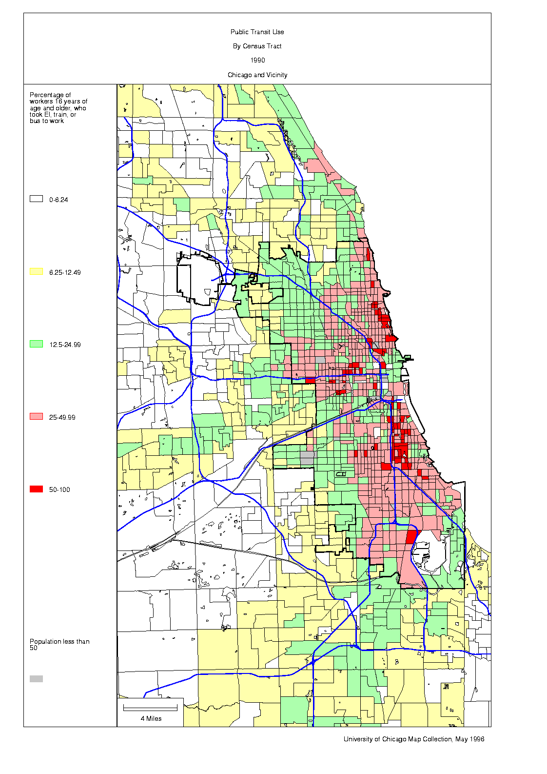
Public transit use. High use of public transit is closely related to housing density. There is hardly any correlation between income and public transit use in Chicago. The relatively well-off, who dominate white-collar employment in the Loop, may even be more likely than the poor to take public transit to work.
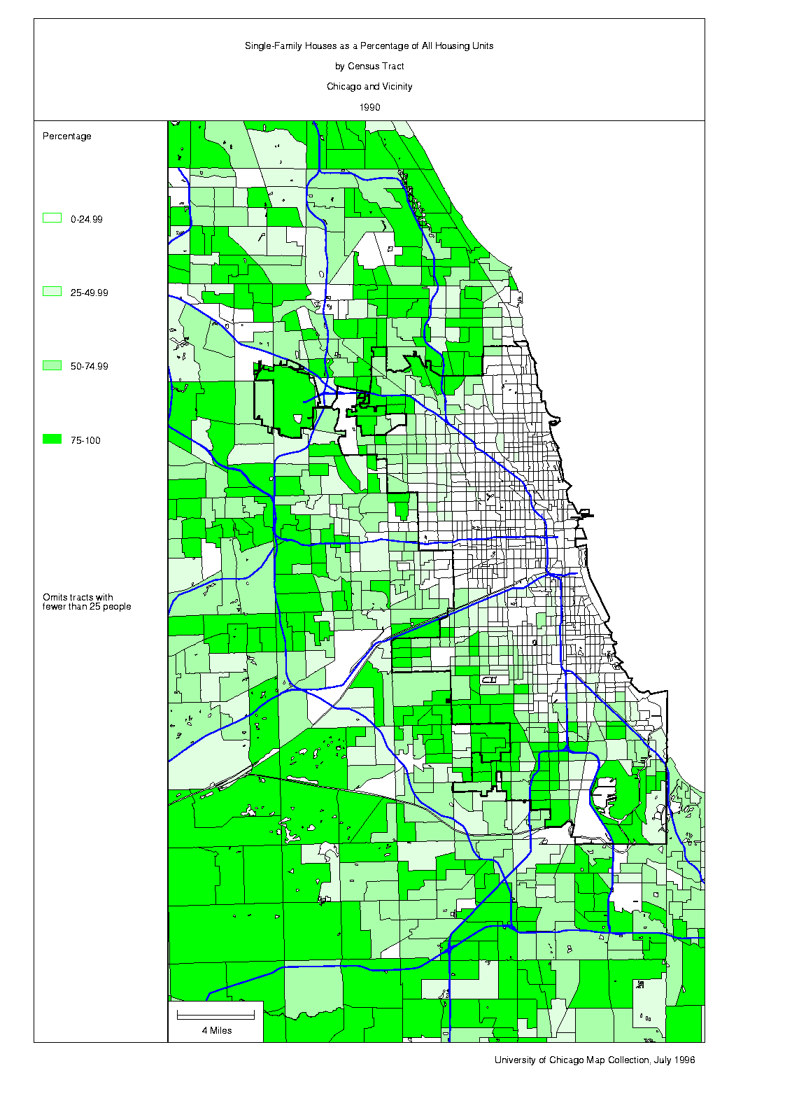
Single-family housing. Detached single-family housing in Chicago is found largely at the edge of the city and in the suburbs, but there are few large areas where it makes up the only housing type.
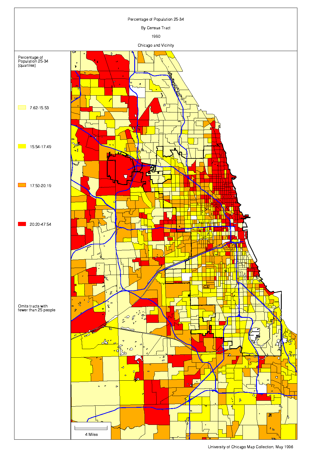
25 to 34 year olds. There is an extraordinarily concentration of 25-to-34 year olds along the North Side Lakefront, from the well-to-do Gold Coast through Lincoln Park, Lake View, Uptown, Edgewater, Rogers Park, and Evanston.
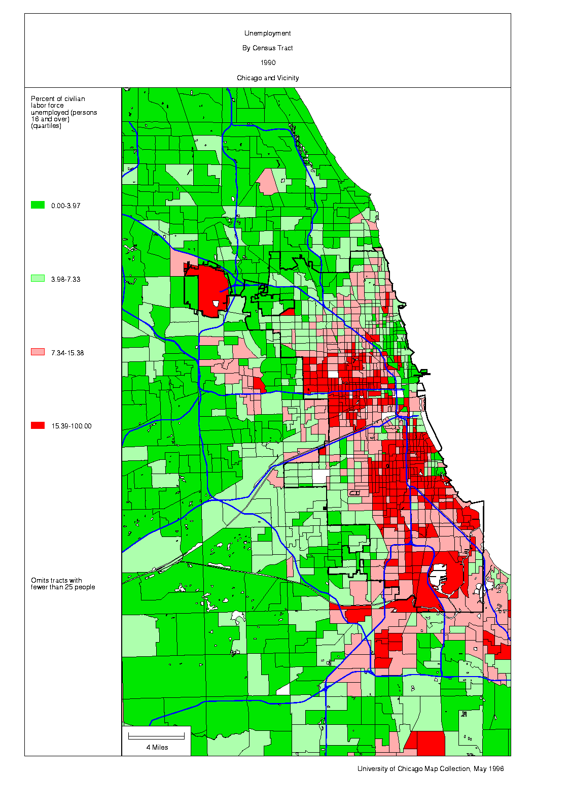
Unemployment. The South and West Sides have the highest incidence of unemployment, the well-off suburbs the least.
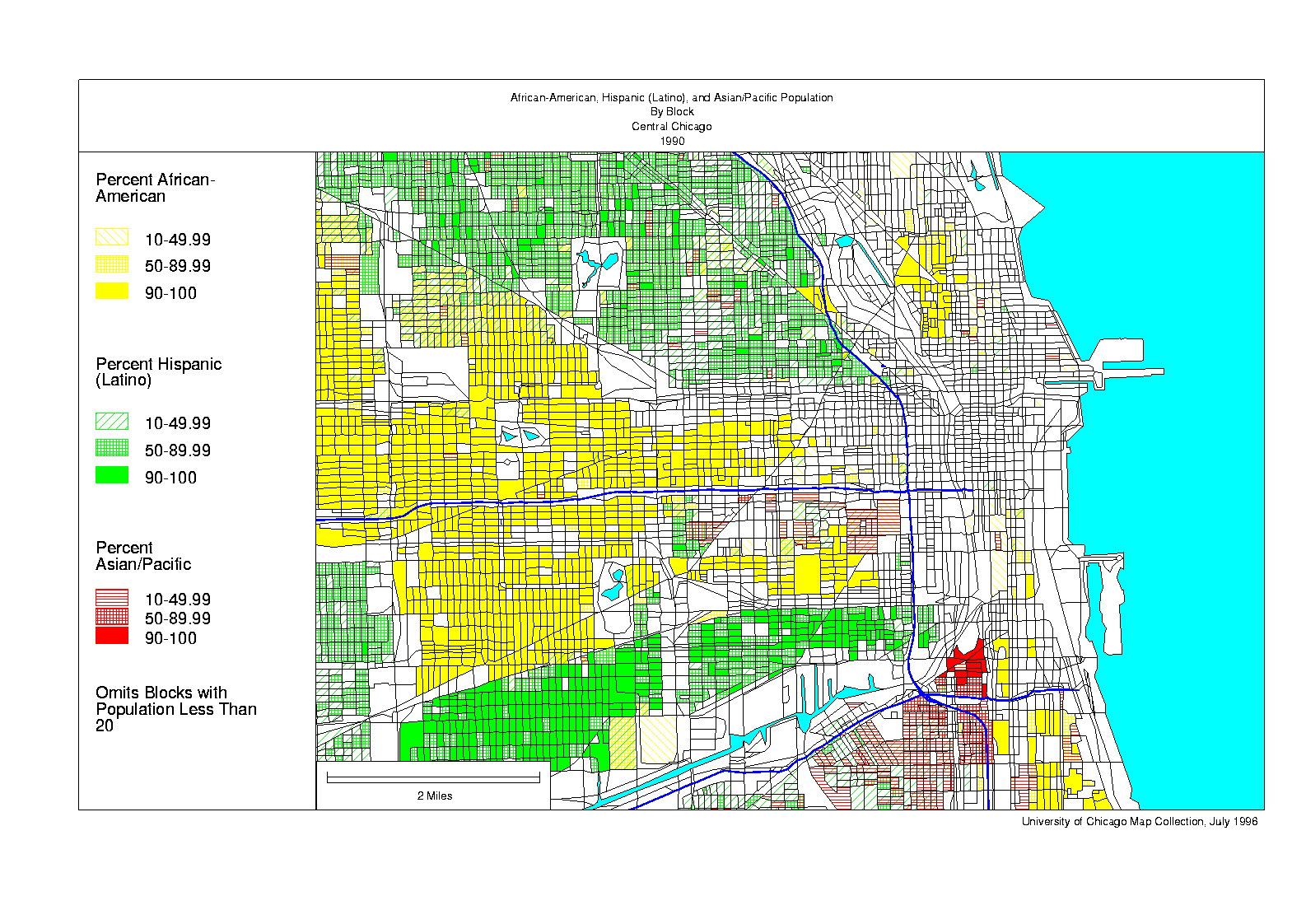
African-Americans, Asians and Pacific Islanders, and Hispanics (Latinos) by block, Central Chicago. This map shows the inner edges of the African-American neighborhoods of the South and West Sides. It also shows Chinatown and the close-to-downtown edges of the Hispanic areas of the Southwest and Northwest Sides. The map also suggests the ethnic complexity of the inner city; note, for example, the essentially all African-American Cabrini-Green next to the predominantly white Gold Coast. This is about as large an area as can be shown clearly at the block level on one computer screen.
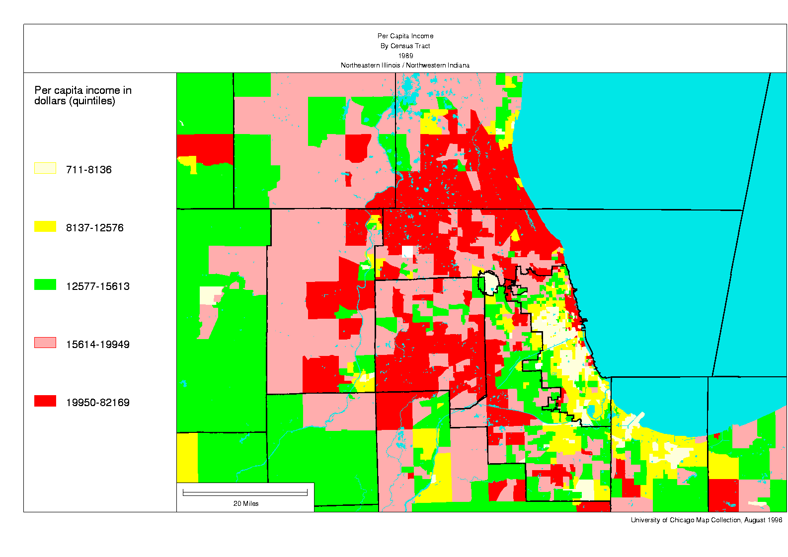
Per capita income by tract, Northeastern Illinois/Northwestern Indiana. When the region is viewed as a whole it is the middle-distance northern and western suburbs that appear richest and the inner city that seems poorest (the contrast would be even more vivid in a map showing the geography of household income). But the situation is in fact much more complicated. The Near North Side of Chicago is one of the wealthiest parts of the metropolitan area while older "suburban" industrial cities like Gary, older "suburban" central places like Waukegan, Elgin, and Aurora, and certain close-in working-class suburbs like Harvey and Maywood are some of the poorest. This map demonstrates the limitations of tract-level analysis of a city 100 miles wide on one computer screen.
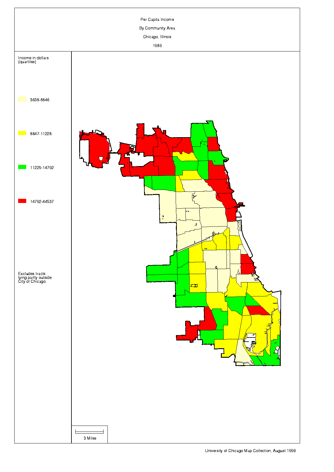
Per capita income by community area, Chicago. Chicago is divided into 77 official community areas many (but not all) of which correspond roughly to the neighborhoods recognized in residents' mental maps.
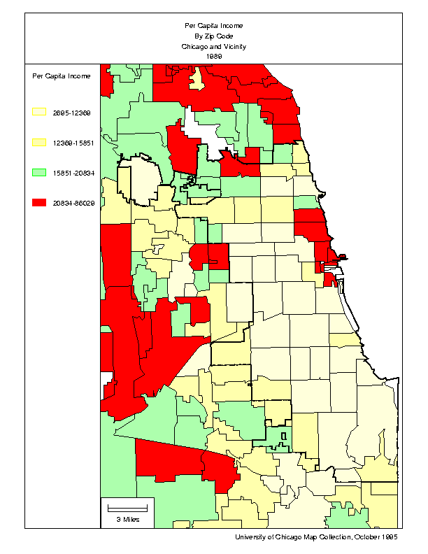
Per capita income by zip code, Chicago and vicinity. No serious urban scholar would argue that zip codes are particularly logical units of geographical analysis, but zip code data are nonetheless convenient for certain kinds of market analysis.
Social and economic indicators are often highly correlated. The distribution of poverty, for example, is likely to resemble the distribution of unemployment, and maps of the two phenomena will look very much the same. Multivariate analysis (usually, factor and cluster analysis) can help one to understand the dimensional structure of a group of variables and to identify geographical areas with a similar set of socioeconomic characteristics. Statistical analysis of this sort is usually known as social area analysis (or factorial ecology) in urban geography and sociology.
Click here to see two 1990 neighborhood-type maps of the Chicago area. The fourteen neighborhood types identified on the map were derived through a two-step process. First, the TRYSYS program (see note) was used to factor 33 important tract-level census variables by the Tryon "key-cluster analysis" method. Four oblique dimensions were identified. Second, each tract was scored on the four dimensions (using a simple sum of standardized scores), and the 1,925 tracts were cluster-analyzed using TRYSYS's iterative partitioning method. Robert B. Dean did the statistical analysis. The maps were generated with ArcView.
The population of the Chicago area grew by less than 2 percent during the 1980s, but the social geography of the region changed substantially. These maps portray certain components of that change.
These maps generally use 1980 tract boundaries (but see note).
On the "dot density" maps used to show population change, one square indicates a gain or loss of between 200 and 399 people. Squares are placed randomly within tracts. Where many squares are placed within one tract, they can overlap and obliterate tract boundaries.
Population change, 1980-1990. The city of Chicago and its inner suburbs generally lost population, while the outer suburbs gained population. The areas of greatest loss were the city's poorest neighborhoods on the South and West Sides. The areas of greatest gain were mostly west of the Tri-State Tollway. But the pattern, in fact, was much more complicated. The areas where population growth was most intense were actually all in the inner city. The area around the Loop and some sections of the Near North Side Lakefront gained population as new apartments and townhouses were put up and industrial buildings were converted to residential use. And large swaths of the West, Northwest, and Far North Sides gained population as immigrants and others crowded for the most part into the existing housing stock. Another exception to the broad pattern occurred in central Waukegan, Elgin, Aurora, and Joliet, which, unlike the suburbanizing lands around them, all lost population.
Ethnic change, 1980-1990. Some of the African-American neighborhoods of the South and West Sides of Chicago, and of Gary, Indiana, were devastated during the 1980s; many tracts lost a quarter of their population; a few tracts lost half. African-American population growth was concentrated on the Far Southwest Side of the city, in the southern suburbs, and along the Far North Side Lakefront. Few African-Americans moved to further-out suburbs. The geography of Hispanic population change was quite different, not least because there was a substantial in-migration of this segment of the population (this was not true of African-Americans and whites). Some Hispanics were eased out of parts of the North Side by gentrification, but most of the established Hispanic areas continued to attract newcomers. Many Hispanics also moved into the peripheries of these neighborhoods and, on a modest scale, throughout the Metropolitan Area. White population change followed a completely different spatial pattern. Except near the Loop and on the North Side Lakefront, white population declined throughout the city and its close-in suburbs while it boomed in the outer city.
Change in real per capita income, 1979-1989 (see note). As in the country as a whole, the well-to-do in the Chicago area became relatively more well-to-do during the 1980s, while the poor became relatively poorer. Per capita income generally rose in the middle- and upper-class neighborhoods, while it generally fell in the poorer neighborhoods. There were nuances to this pattern. For example, the newly gentrifying western edges of Lincoln Park and Lake View, and the newly settled periphery of the Loop, did better in percentage terms than the established well-off neighborhoods. And the African-American neighborhoods (with some exceptions) did better than the Hispanic neighborhoods.
Change in public transit usage, 1980-1990 (see note). Public transit use in Chicago declined during the 1980s as jobs and people moved outward and transit agency cutbacks affected levels of service. This decline was not uniform. Public transit did well in the only two suburban areas--the Southwestern suburbs and Northwestern Indiana--where the quantity and quality of rail service increased; it also did well in the outer fringes of the urban area where farms were replaced by housing. Public transit generally did least well in the outer city and inner suburbs, perhaps in part as a result of the decline in the quantity of train service in the early 1980s. In the inner city, the changing geography of transit use was so complicated as almost to defy description, but, in many places at least, there was only modest change.
Christopher Winters
Bibliographer for Geography, Anthropology, and Maps
JRL 370, (773) 702-8761
e-mail: wintersc@uchicago.edu
© The University of Chicago Library
1100 East 57th Street Chicago Illinois 60637
Phone Numbers
